User Research, wireframing and prototyping, usability testing, and UI Design
Duration:
November 2021 – July 2022
Deliverables:
Design and prototype of a mobile website for Rose End Nursery
THE PROBLEM
Online shoppers find the process of ordering custom clothes difficult and intimidating.
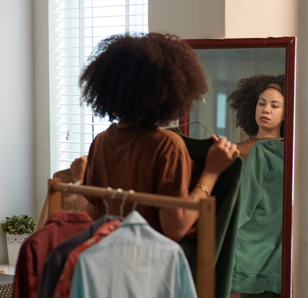
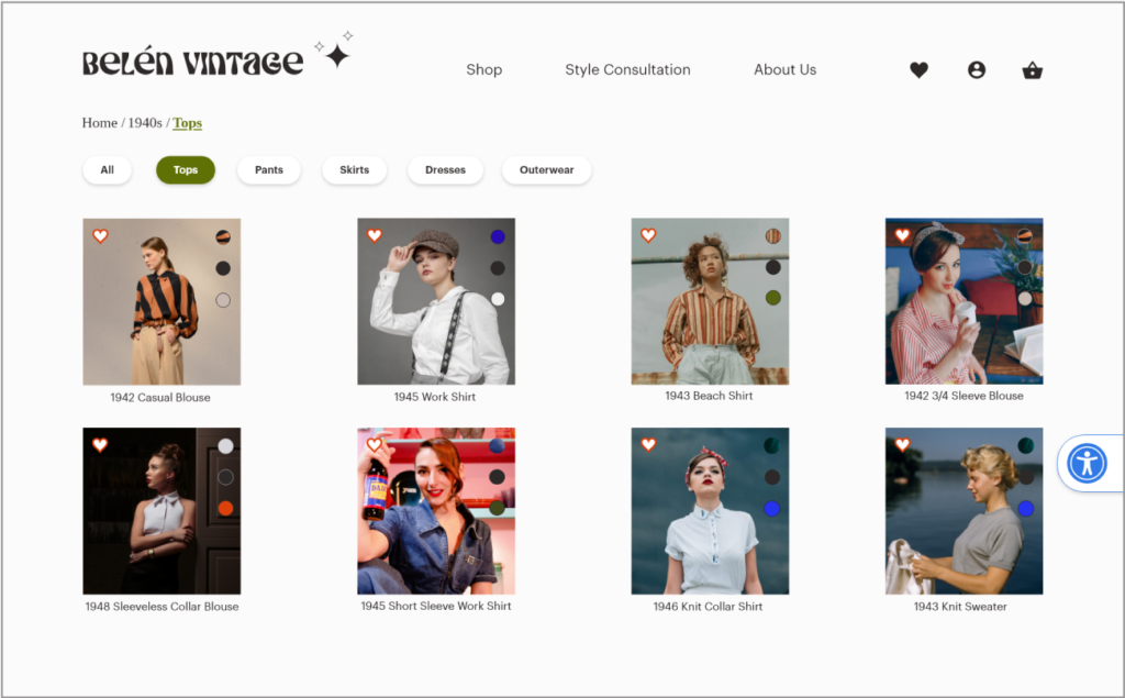
Belén Vintage is a hypothetical brand created out of my own passion for vintage and custom clothing. After noticing the issues surrounding completing custom orders, from the perspective of shoppers and the brand, I wanted to design a website that would streamline the process of taking custom orders by showing customers how to take their measurements and create a garment to their specifications.
DESIGN PROCESS OVERVIEW
My design process prioritized user and business needs through extensive testing and iteration to ensure a seamless and effective solution.
To design the Belén Vintage website, I followed a comprehensive design process. I aimed to understand and address common business goals and challenges, such as low conversion rates and high site abandonment during the customization process.
I conducted a competitive analysis and user research through surveys and interviews, and created an affinity map to gain insights into similar businesses and user experiences with online shopping and custom clothing.
I created user personas and user journey maps to help me empathize with users and define the user flow. I also created a site map which helped me structure the website to enable efficient navigation.
In the ideation phase, I created wireframe sketches, and low-fidelity mockups, keeping in mind best practices from leading research organizations such as Baymard Institute and Nielsen Norman Group.
Once I had a working prototype, I conducted two usability tests. I tested my low and high-fidelity prototypes, making many intermediary iterations before finalizing the design.
BACKGROUND
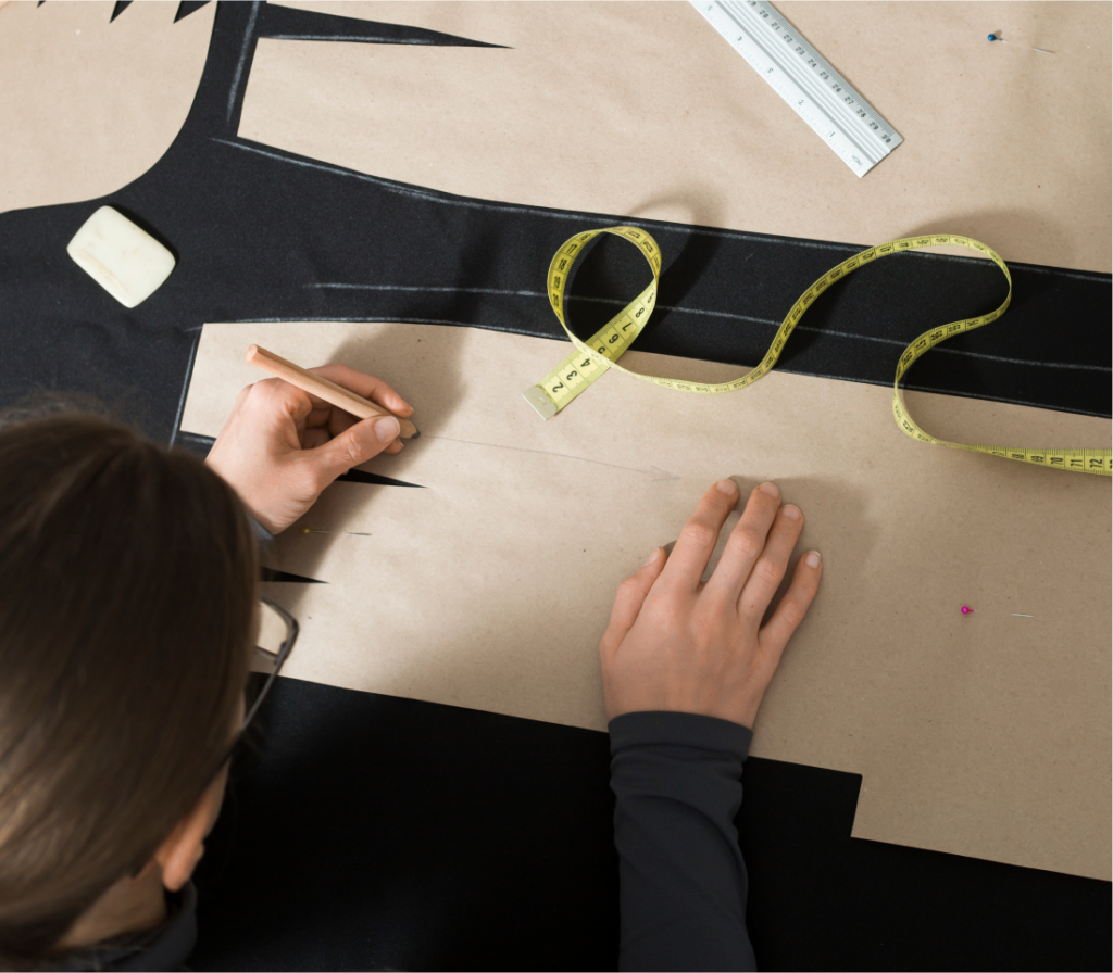
My love for vintage fashion and my experience as a seamstress inspired me to design a vintage custom clothing website. As a seamstress, I appreciate the unparalleled comfort and poise of wearing custom clothing. I want to make that experience accessible to more people, but one of my biggest frustrations has been getting accurate measurements from clients.
I started to look around at what other seamstresses were doing to collect measurements from clients remotely. I talked to seamstresses and tailors about their experiences and frustrations with collecting measurements and found that communication with clients was often inefficient, causing frustration and wasted time on both ends.
Etsy, for example, relies on a one-size-fits-all selection process which provides an overwhelming list of options and unclear guidance for taking measurements. One tailor I spoke to said they spent many additional hours sorting through messages and answering questions about getting measurements. Their frustration was that it was difficult to get paid for all the time spent providing this additional assistance to clients.
The Belen Vintage website became the result of my efforts to design an efficient, intuitive method for collecting measurements that would be enjoyable for those of any level of experience.
THE SOLUTION
A responsive website that streamlines the customization and checkout process.
1
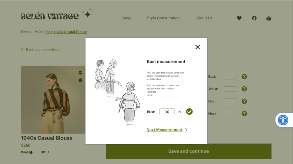
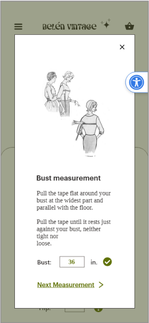
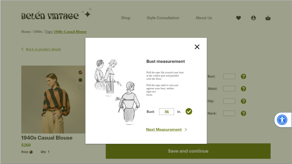
Guide users step by step through taking their own measurements (eliminating the need for users to leave the site in search of instruction).
2
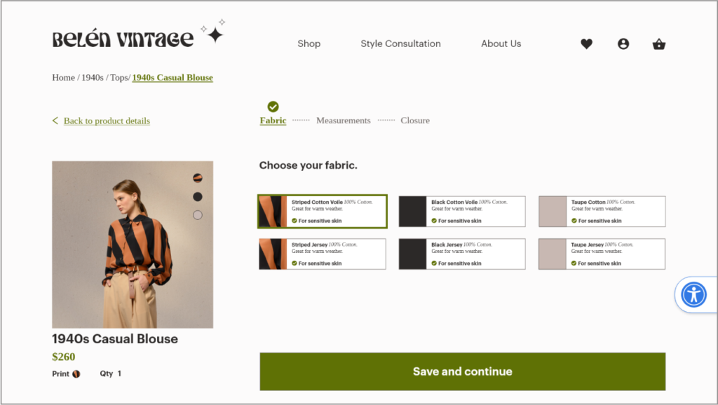
Provide important information about customizationoptions to aid users in their selection.
3
Create an easy to follow navigation system that takes the customer from browsing, to customizing, to checkout.
WHY?
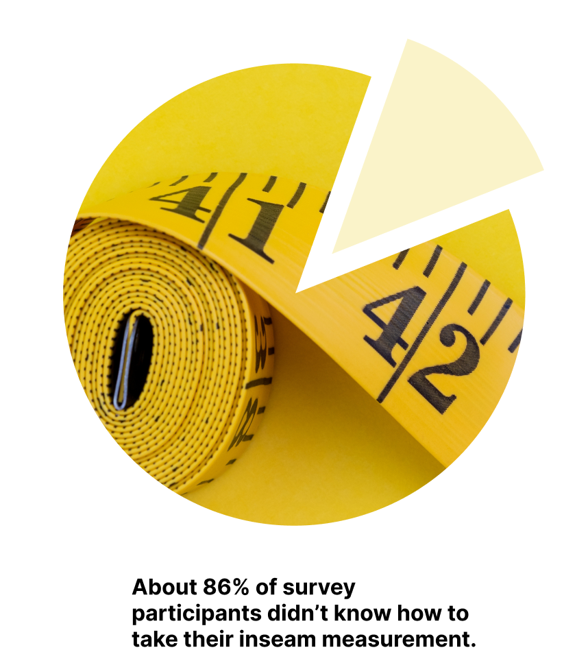
In a survey I conducted, 19 out of 22 participants said that if asked to give an inseam measurement they would have to google how to do it.
When users have to leave your site to find information it creates an interruption in your user flow and increases the chances that they won’t complete a purchase.
Because Belén Vintage is a custom clothing site it is imperative that the customization and checkout processes are optimized. Customization requires more time than a standard clothing site and therefore the risk of site abandonment is greater.
BUSINESS OPPORTUNIES
Reduce the time required to complete a custom order, reduce cart abandonment, and increase sales.
Create a measurement guide to reduce customer confusion and the occurrence of fit issues and returns.
Simplify the navigation and checkout process to reduce the time required to complete a purchase, increasing sales.
COMPETITIVE ANALYSIS
Belén Vintage occupies a niche market of companies offering custom clothing online. These companies do not offer vintage styles but provide a model for how this type of process can be designed.
Other brands’ shortcomings:
Too many decisions on each page
Long, drawn-out processes
Visually overwhelming design
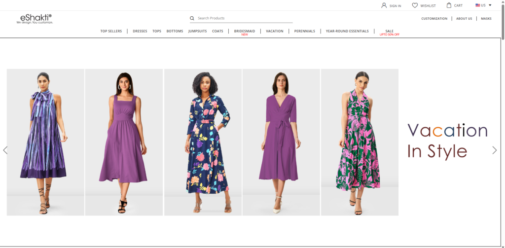
Eshakti
Pros:
Many customization options
Auto-saves measurements
Cons:
Does not allow custom closure
Visually overwhelming
Customization process is not straightforward
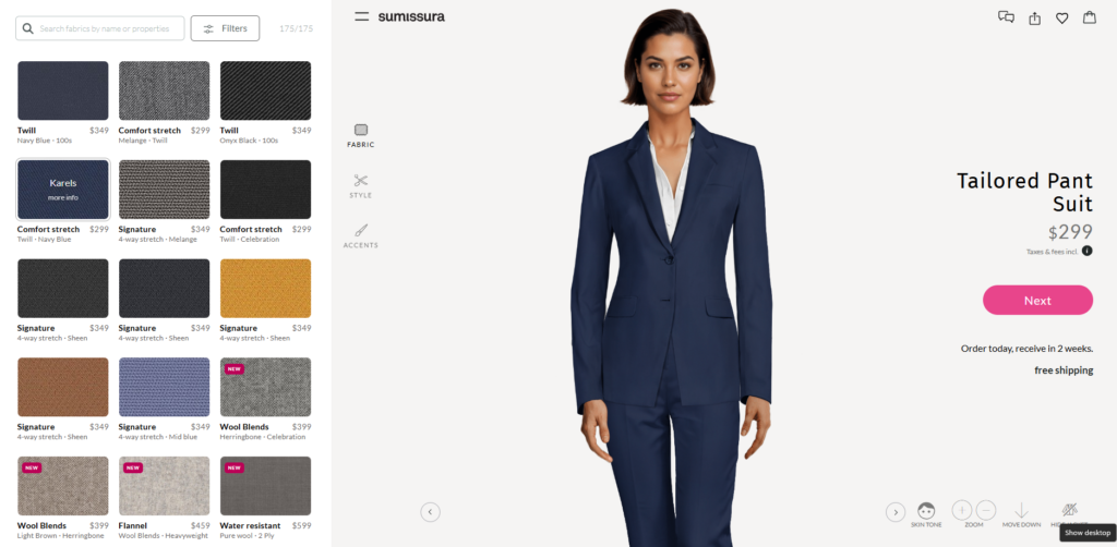
Sumissura
Pros:
Precise instructions for taking measurements
Includes video to show how to take measurements
Auto-saves measurements
Cons:
Guesses measurements based on height and weight which is inaccurate
Process is confusing and overwhelming
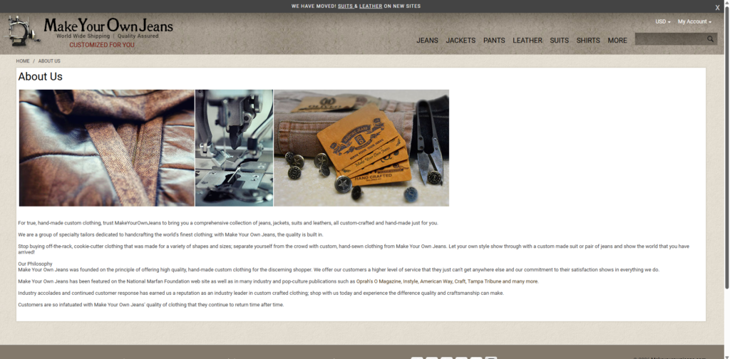
Make Your Own Jeans
Pros:
Process short and to the point
Step-by-step process to customize jeans
Includes instructions to take measurements
Cons:
Outdated site
Visually unappealing
Measurements form looks crowded
Measurement instructions lack visuals
Competitor's features to avoid
Too many decisions on each page cause decision fatigue
Long and drawn out processes lead to site abandonment
Visually overwhelming design causes high cognitive load
Possible Solutions
Limit the number of decisions a customer has to make on each page
Keep processes short and straightforward
Minimize design and reduce distractions
Best features offered by competitors
Easy-to-follow, step-by-step instructions for taking measurements
Auto-saves measurements
Process short and to the point.
USER RESEARCH
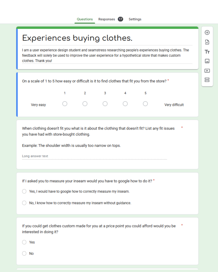
Finding participants with experience ordering custom clothing was a challenge. First, I posted a survey about experiences buying custom clothing online in various subreddits. After receiving no responses I posted a survey about online clothes shopping more generally, asking about difficulties with sizing and measuring. I found that this gave me some of the feedback I was looking for, such as whether people need guidance on taking measurements.
I had the same difficulty finding interview participants with experience ordering custom clothing, so I talked to people about their experiences shopping for clothing online. To get more information about people’s experiences with custom clothing websites I searched on YouTube for reviews of similar stores. These reviews provided more details on issues people face buying clothing from these sites.
Overall, I surveyed 17 people and interviewed 5 people, aged 18+, about their experiences ordering clothing online.
I asked participants about:
fit issues with clothing they ordered online
guidance needed to take an inseam measurement (if any)
interest in getting custom clothing made
experiences buying custom clothing
experiences buying clothing
I aggregated this feedback using affinity mapping to find insights. The feedback from my survey, interviews and YouTube reviews can be seen here: https://miro.com/app/board/uXjVPfOczks=/
INSIGHTS
1
Guidance is needed to help take measurements
The majority of participants stated that they would have to search how to take an inseam measurement if asked to do it.
2
Participants are frustrated by a long process with a lack of milestones
Those who ordered custom clothing online said that taking measurements can be time consuming.
Participants said they didn’t like when the checkout process didn’t indicate where they were in the process.
Participants are frustrated by how long it takes to find measurements and decide on size when buying standard size clothing.
3
Customization is confusing and overwhelming
Some participants felt overwhelmed by the number of options.
Finding measurements can be overwhelming and confusing.
DESIGN APPROACH
Reduce cognitive load
Much of the frustration users experience can be resolved by reducing the cognitive load of the website.
Cognitive load refers to the mental energy required to process information. The higher the cognitive load, the higher the likelihood that users will quit a task.
Keeping cognitive load low was an important consideration throughout my design.
Some ways to reduce cognitive load:
Break down information into smaller chunks (Miller’s Law)
Reduce the number of decisions or inputs required of a user at any one time (Hick’s Law)
Simplify information and reduce redundancy
Guide users by maintaining good visibility of system status
Keep design consistent and follow industry standards
Limit what a user has to remember at any given point
Provide help and documentation at the moment the user requires it
USABILITY TESTING AND ITERATION
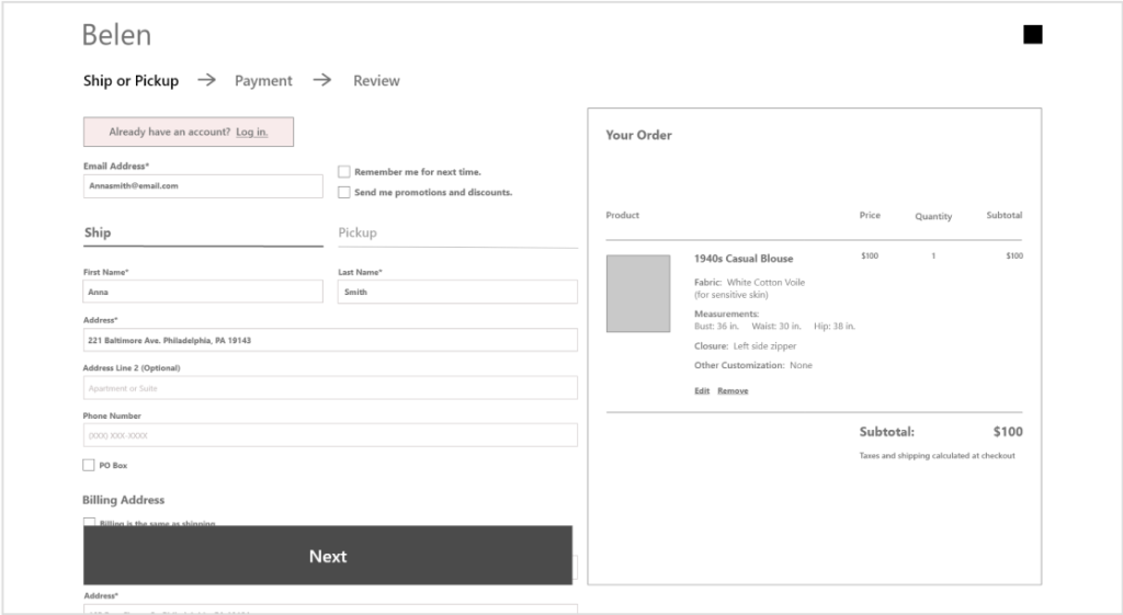
I conducted two usability tests, one for the low-fidelity and one for the high-fidelity prototypes. For the low-fidelity prototype I tested the desktop, tablet, and mobile screens, each test with 5 participants. After getting feedback, analyzing it, and making changes, I tested the high-fidelity prototype’s desktop and mobile screens with 5 participants each. I decided to focus on these screens since the tablet was not significantly different. After the second usability test I made changes based on user feedback.
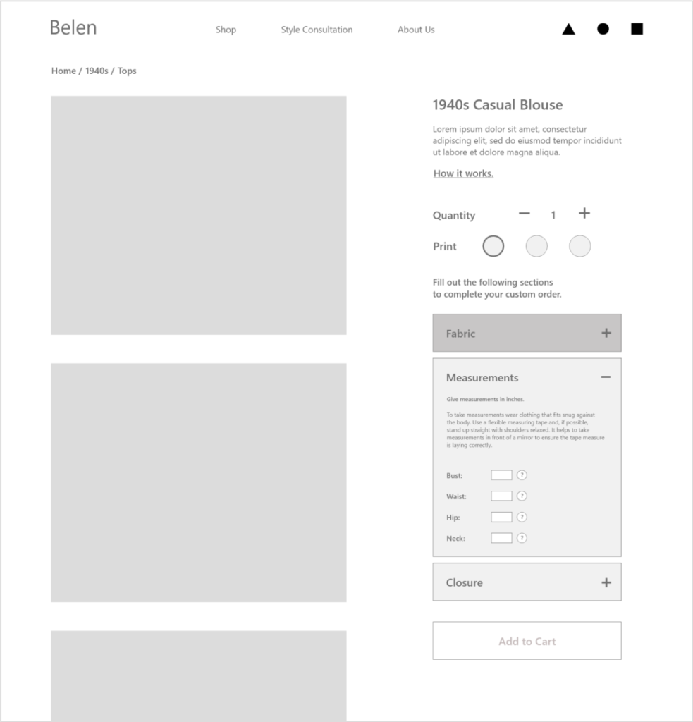
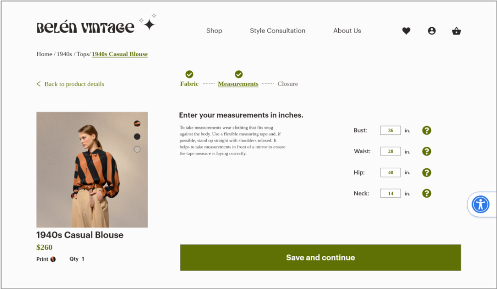
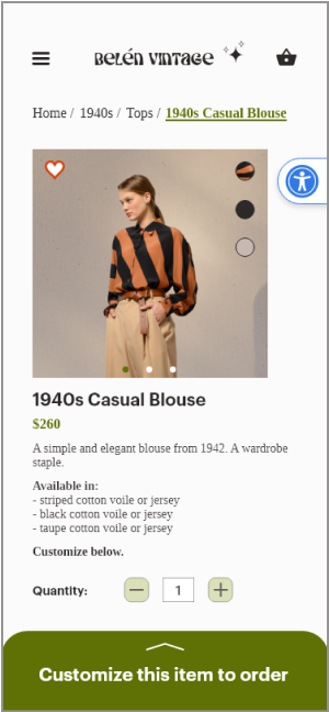
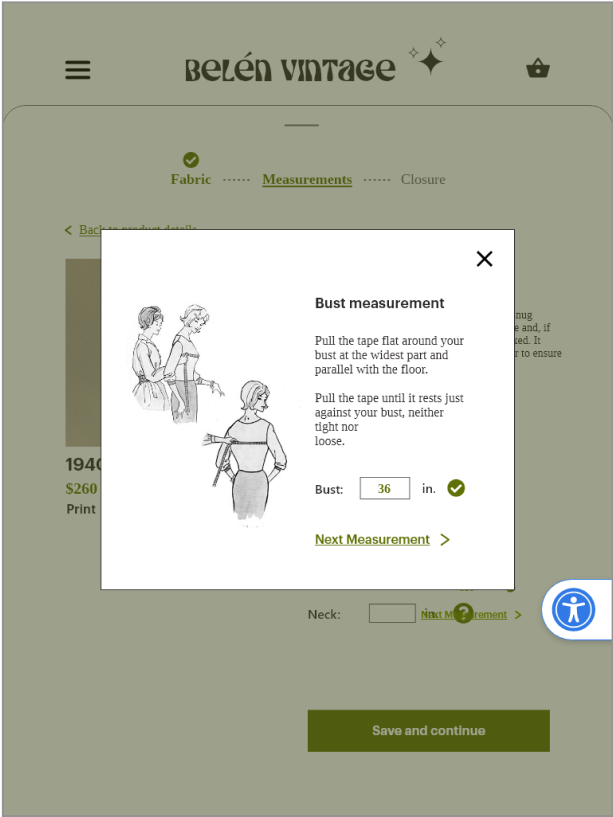
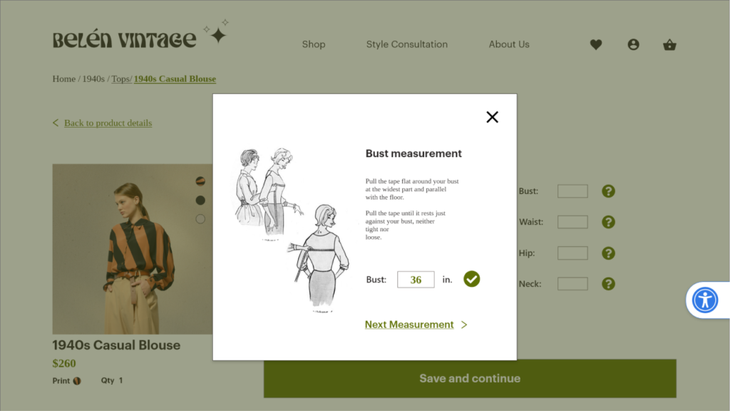
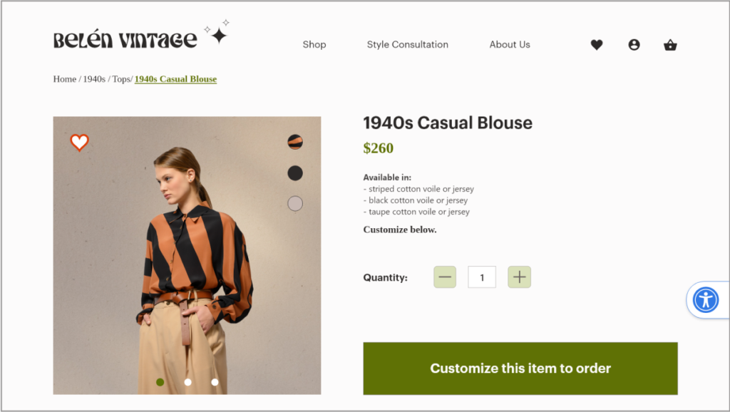
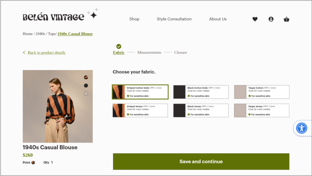
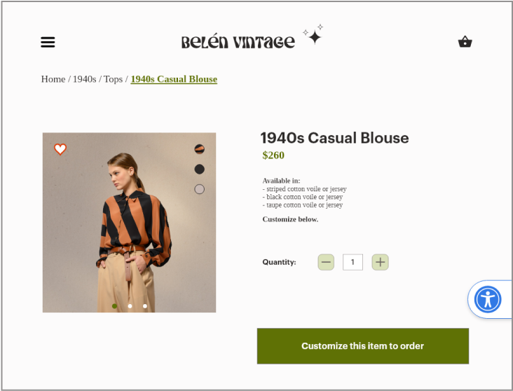
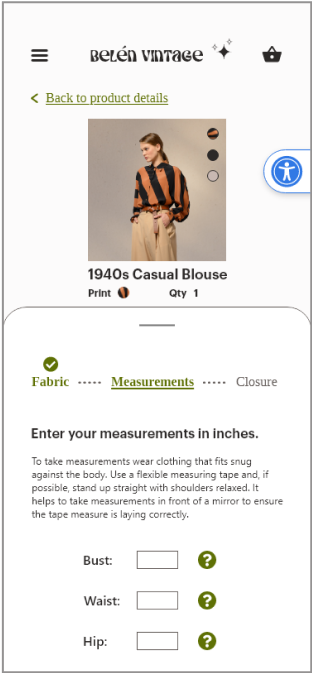
Customization
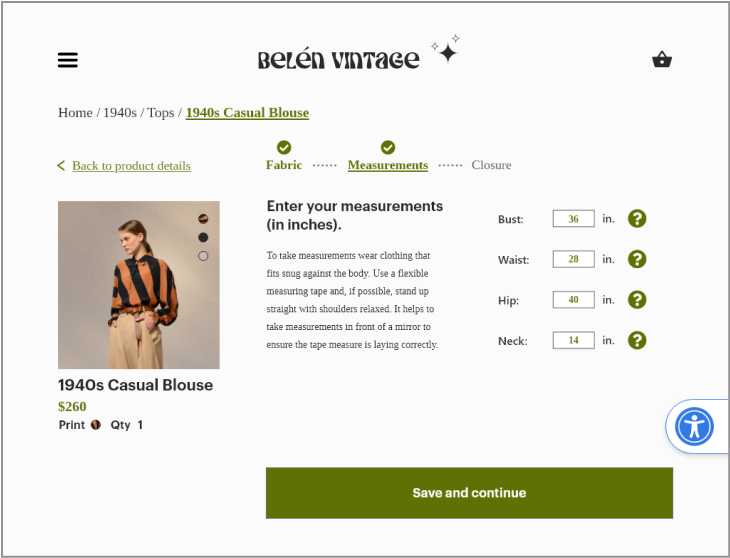
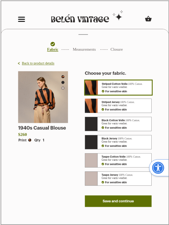
In my initial designs I created an accordion style menu for the customization section on the product page. The idea was to separate the portions of customization into fabric selection, measurements and closure selection, thereby chunking information.
During usability testing, users said they felt unsure about what had happened to their selection or entry when they moved on to the next section. Users also became confused by what they were supposed to do in this section.
Changes I made in the next iteration:
Placed each step of the customization process on a separate page, giving more prominence to the information and reducing cognitive load.
Placed a progress bar at the top of the page to show users that each section is part of a process that needs to be completed.
Placed a green check mark above completed sections to show that the information has been saved.
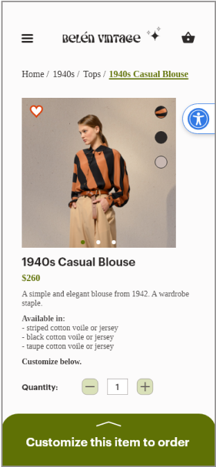
Placed the call to action button large and visible, above the fold.
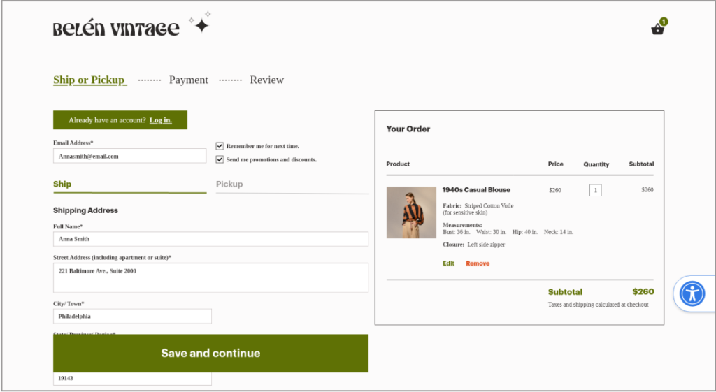
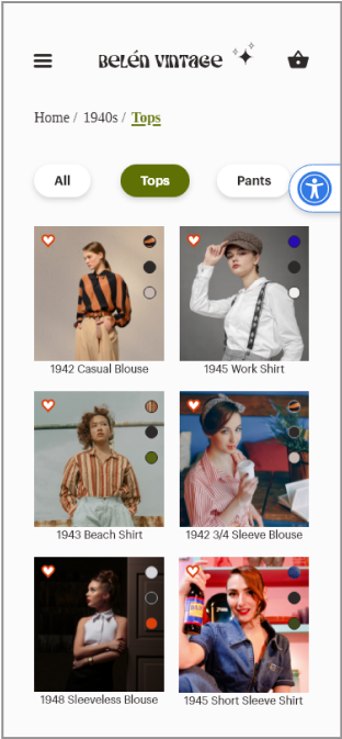
Navigation
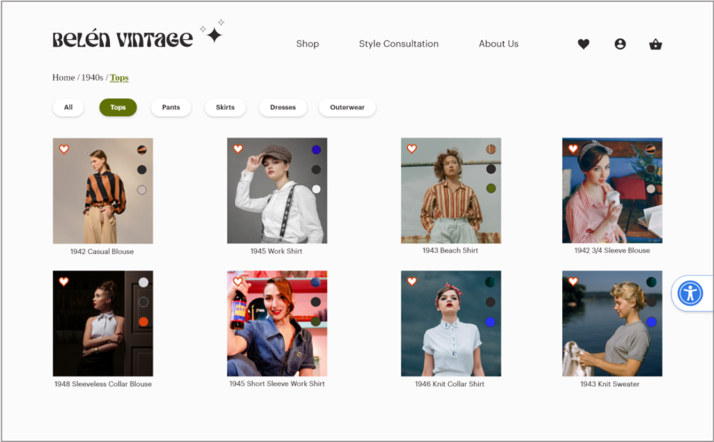
In my initial designs I added breadcrumbs to the top of the page to allow easy navigation to previous pages and show users where they are on the site. This can improve marketing, user engagement, and conversion rates.
Breadcrumbs are also important for SEO as they give search engines a clear understanding of a website’s hierarchy. This helps search engines to crawl and index the site more effectively which can improve website visibility and rankings
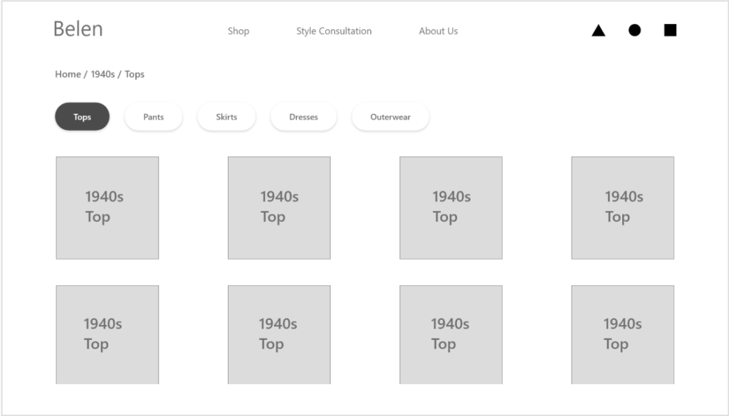
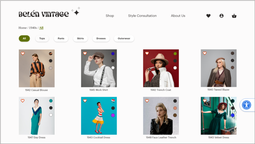
I added tags above the product so that users could filter by type of garment.
Changes I made in the next iteration:
During usability testing it was mentioned that having an “all” tag would make sense to allow users to see all the products as a default. The breadcrumbs were adjusted to highlight the current page by bolding and underlining the current page.
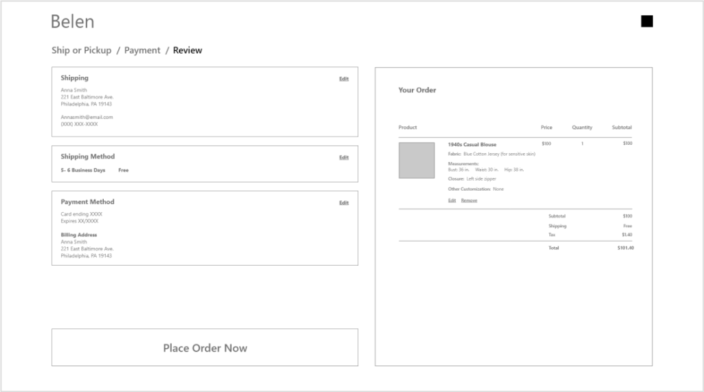
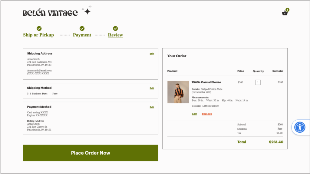
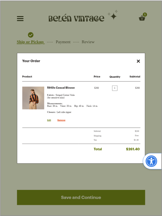
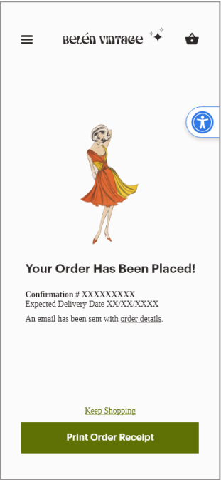
Checkout
For the checkout I added a progress bar to let customers know where they are in the process.
I kept the order details to the right of each checkout page so that customers can see how the price reflects their selections in real time.
I kept edit and remove buttons visible below each item to allow customers to make changes without losing their place in checkout.
I made the call to action button large and bold on the page with a fixed placement so that it is always visible above the fold when scrolling.
Changes I made in the next iteration:
I changed the breadcrumb arrows to dotted lines to create more of a flow appearance. I also bolded and underlined the current page.
“Ship or pickup” will also show a check mark once the delivery method has been chosen.
Several test participants didn’t see how they could change the quantity at this point. I added a box around the number to signal that this entry could be changed.
ACCESSIBILITY
Font size
Web Content Accessibility Guidelines recommend a size 16 for body text. I maintained a size 16 or greater for much of the body text throughout my project. There were a few sections on the mobile screens in which I could not avoid using a smaller size.
Color and Contrast
I used a contrast checker to ensure compliance with WCAG guidelines. I used a white (background) and a green (buttons, links, highlights) that met the minimum contrast of AA with a ratio of 5:28 which is considered good for both small and large text.
Accessibility Settings
I added an accessibility settings widget, which allows a user to adjust the UI to suit their needs. This could be implemented with an accessiBe widget or something similar.
The widget would also be hideable and movable if the user found it inconvenient. From examples of accessible sites I have seen, the widget was kept on all screens. I struggled with the widget placement between the different screens but decided that offering the ability to hide or close it would be a good solution.
RESPONSIVE DESIGN
I designed screens and prototypes for Desktop, Tablet (both horizontal and vertical), and mobile. I paid attention to the details of each experience, taking into consideration how the user would interact with it.
For example the desktop and tablet have some similarities in terms of layout, but the desktop may require a mouse while the tablet may require tapping with fingers.
I tested and received feedback for each design from at least 5 people.
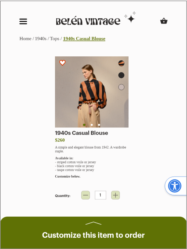
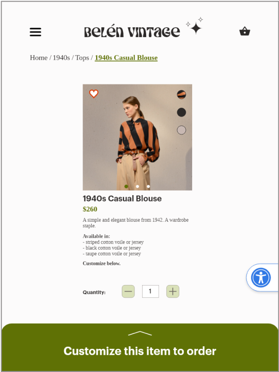
Mobile
Tablet Vertical
Desktop
Mobile
Tablet Vertical
Desktop
USER FLOW
I designed this website to guide users through a clear, intuitive flow. Throughout the process, I incorporated user feedback to ensure visitors always understand what step they’re on, what they’ve completed, and how to move forward or back at any point. I also drew on familiar interaction patterns from widely used interfaces, creating an experience that feels predictable, seamless, and easy to navigate. Watch the video below to see the full user journey.
FINAL SCREENS
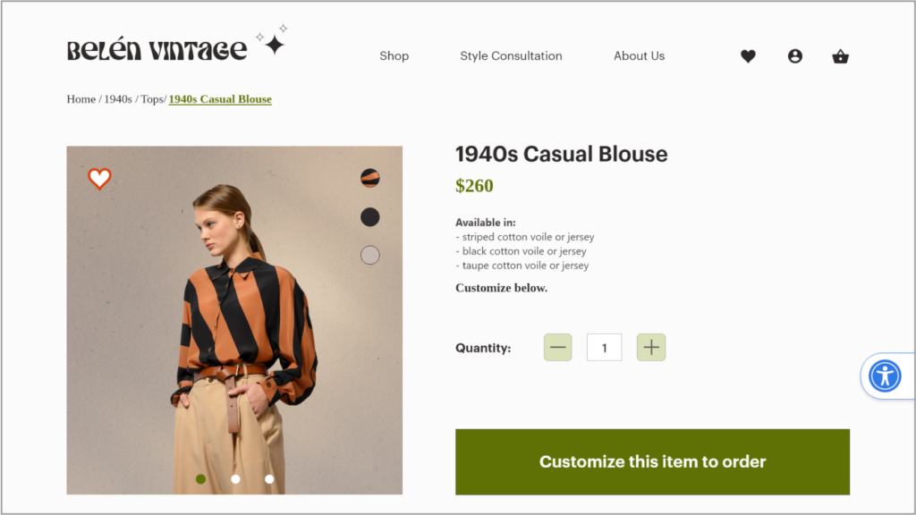
Desktop
Tablet Horizontal
Tablet Vertical
Mobile
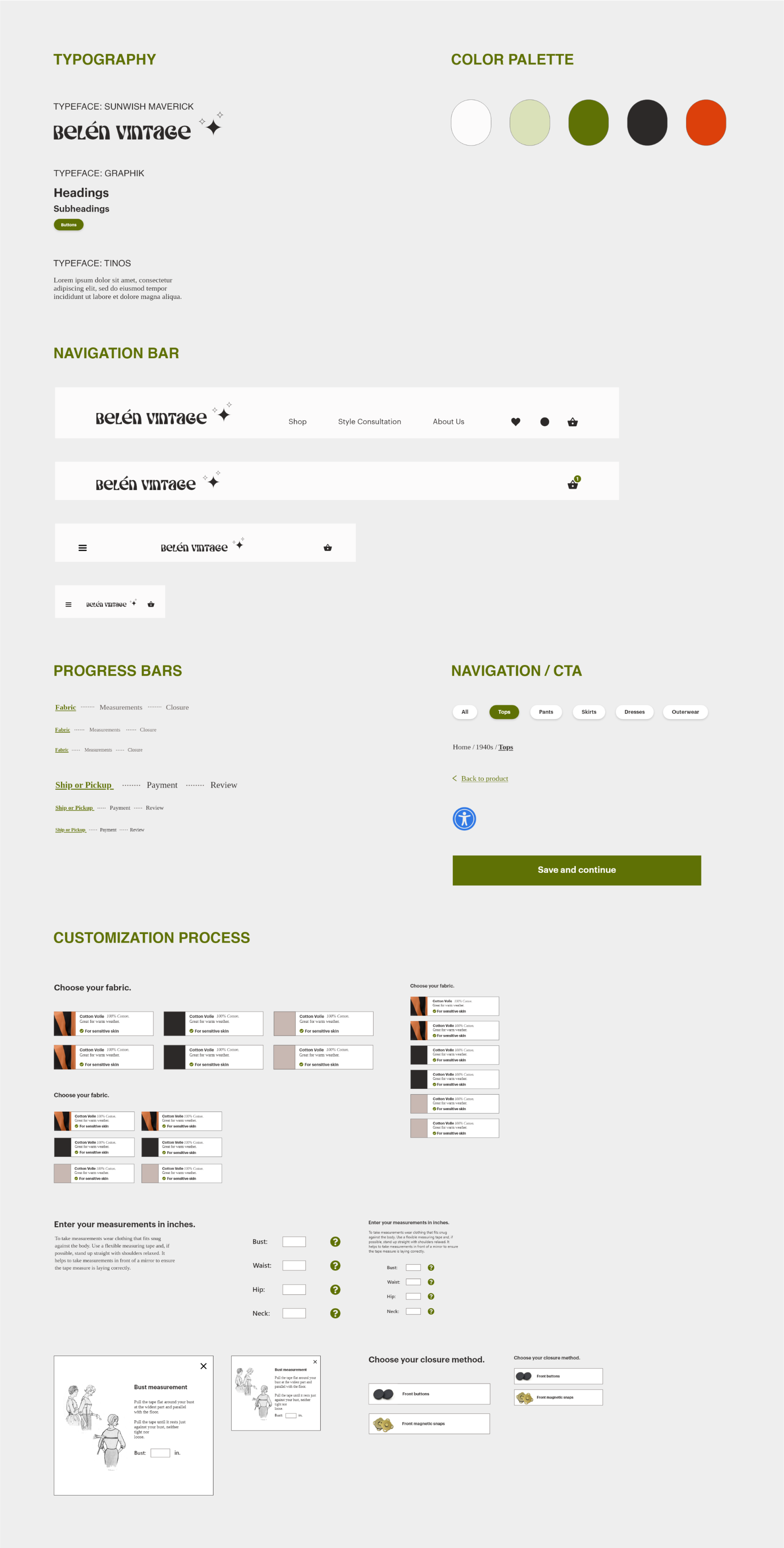
DESIGN SYSTEM
To ensure consistency and efficiency during the design phase of my project, I developed a design system. A design system makes it simpler to collaborate with others and hand off designs to developers.
Additionally, by designing components in various sizes to account for responsive design, I could quickly compare and adjust them to ensure they looked consistent on different screen sizes.
Typography
I chose the typeface Sunwish Maverick for the brand’s icon because it resembled Art Nouveau era typefaces, which is a style that reappeared in the 1960s and gives vintage appeal and a bit of whimsey. I chose this out of a selection of similar fonts for its legibility.
For the headings I chose Graphik which is a classic, bold, sans-serif typeface that draws the eye. I paired Graphik with Tinos, a serif font, for the body text, which added character and sophistication reflecting the brand’s quality and style.
Color Palette
I used a minimal color palette of light olive, dark olive, off-white, black, and tomato red (for warning text). I chose high contrast colors to meet accessibility guidelines. Light and dark olive colors were chosen because they pair well with a variety of other colors, just as green in nature provides a neutral backdrop for flowers. Green is also a calming color associated with nature and typically signifies that it is safe to proceed (e.g. green traffic lights). The dark olive green was used for call to action buttons for its contrast with the white page.
Lessons Learned
Overall I am happy with the design and the work that I put into it. There were many iterations, more than can be shown here, and my finished design reflects my careful considerations.
I used my existing knowledge of design principles and best practices but also gained a lot through research. Based on the feedback from users I was able to get a good idea of what users would expect to see and kept those considerations in mind as I designed.
Some things I would change in future iterations:
Make adjustments to the forms, using form design best practices based on research by institutes and organizations like The Baymard Institute or Nielson Norman Group.
On my landing page I added an instant play video clip and to be more accessible I would consider making the playback pausible or play on tap. For those with cognitive processing impairments, a video that plays automatically can be distracting or overwhelming.
In the future I would design more error feedback. At the moment I have buttons that signal users to complete above sections first but more specific feedback about user errors would be helpful.
For more inquiries, or to grab a coffee, email me at [email protected].