My Role:
GIS Technician and Data Analyst
Responsibilities:
Research, Geoprocessing with ArcGIs, Data analysis
Duration:
June 2021 – July 2021
Deliverables:
Maps, Graphs, research paper
In this analysis I plan to evaluate the street tree coverage in the City of Philadelphia. Specifically, I will be comparing the street tree coverage to median household income and percentage non-white households throughout the city to see whether there is a correlation between them.
The benefits of trees to urban environments are well documented in many studies and includes benefits to public health and safety, wildlife, air quality, infrastructure, property values, and the economy.
Trees can transform neighborhoods, make them visually more appealing, reduce stress to pedestrians and drivers, improve the mental and physical health of residents, help children to focus, improve air quality, reduce the heat island effect of the urban environment, manage storm water runoff, and much more. For underserved neighborhoods especially, having more trees may improve morale, improve quality of life, and give more access to natural surroundings than parks alone.
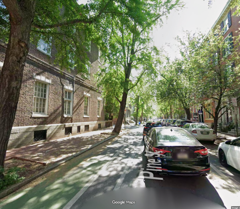
For this project I will be isolating the street tree coverage from the total tree coverage because tree coverage along streets provides benefits that differ in some ways from the tree coverage in parks.
Trees along streets provide shade to pedestrians and drivers and because streets get so much daily traffic, they can benefit more people than parks alone. For people with limited time to visit parks, trees along the street can provide some of the benefits of parks right outside of their homes. Everyone should be able to leave their home and see trees on their way to work or school.
Data used included: land‑use, land‑cover, census tract, income, racial composition, and 1937 HOLC data.
Extracted tree canopy from land‑cover raster; removed park areas using land‑use polygons.
Clipped remaining canopy to transportation land‑use to isolate street‑tree canopy.
Calculated street‑tree canopy percentage per census tract using transportation area as the denominator.
Joined census income and racial‑composition data to tracts; calculated percent non‑white households.
Created maps and graphs comparing street‑tree percentage with income, racial makeup, and race–income relationships.
Compared present‑day canopy and demographic patterns with 1937 HOLC “hazardous” areas to assess historical inequities
The analysis revealed significant overlap between historically redlined neighborhoods (Grade D areas on the HOLC map) and current low-income neighborhoods, high non-white population areas, and areas with low street tree coverage in Philadelphia.
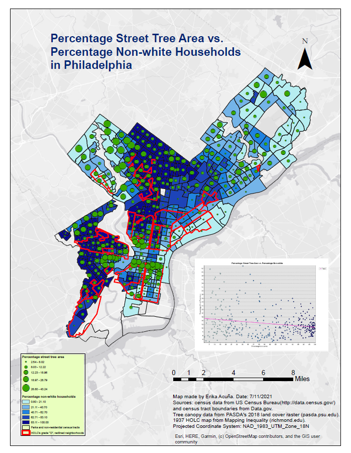
The maps visually reinforce how historical redlining continues to shape present-day disparities in urban greenery, income, and racial composition illustrating structural inequality across time.
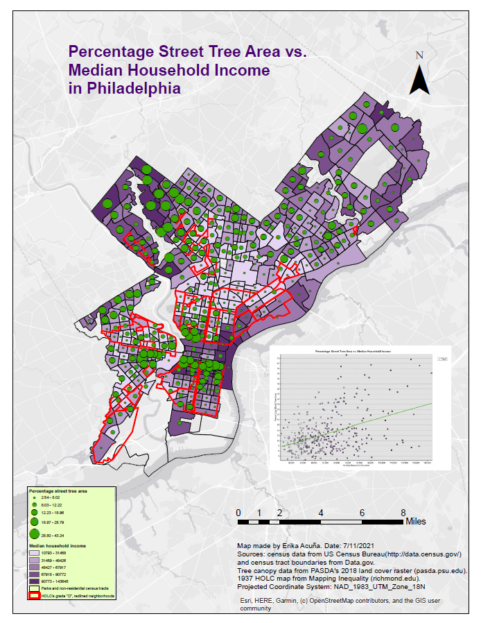
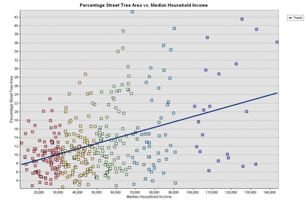
The results show a positive correlation between median household income and percentage street tree area, as was hypothesized. Causation is still undetermined, and it is not clear what other factors could be affecting this result. One possibility is that certain neighborhoods that were designed to house working class and poor residents were built more densely, with smaller parcels, and smaller transportation areas. Smaller parcel sizes and streets could limit the space available for trees. It would be good to examine the density of parcels within census tracts to see how much this correlates with percentage street tree areas.
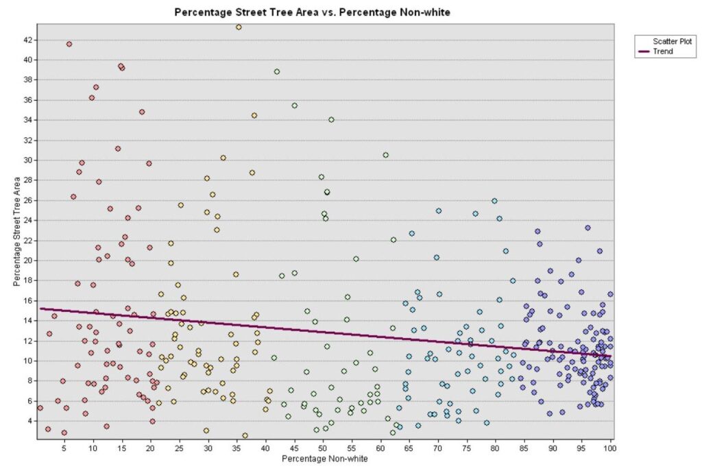
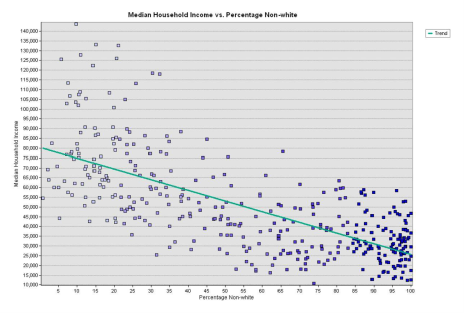
The results of the comparison between percentage of non-white households and street tree percentage showed a negative correlation, with lower street tree percentages correlating with higher percentages of non-white households. This, along with the apparent correlation between tracts with the highest non-white household percentages and redlined areas paints the picture that there is a connection between historical efforts to disinvest from non-white communities and the low tree coverage areas in predominantly non-white communities.
It also makes sense that areas of low median household income would overlap with areas of high percentage non-white households, given the history of racism and discriminatory practices in the US. It is difficult to say exactly what is the cause of low street tree percentage in low-income and non-white tracts, but it could result from various factors at play, likely with their root causes in classism and racism.
For further analysis it would be good to compare data on income, race, redlining practices, and parcel sizes for other cities in the US. For instance, it would be interesting to see how tracts in Los Angeles compare, to see if the same correlations exist. This could be a good comparison because parcel sizes are likely to be bigger due to the sprawling development in Los Angeles. There may still be a correlation between income, race, redlining practices and low street tree density, but if the parcels are larger in Los Angeles, large enough to accommodate more trees, then it would be possible to see that parcel size is not the sole reason for low street tree areas in low income and non-white communities.
For more inquiries, or to grab a coffee, email me at [email protected].
Thank you for reading!