User Research, wireframing and prototyping, usability testing, and UI Design
Duration:
November 2021 – July 2022
Deliverables:
Design and prototype of a mobile website for Rose End Nursery
THE PROBLEM
How do we make it easy to shop for plants online?
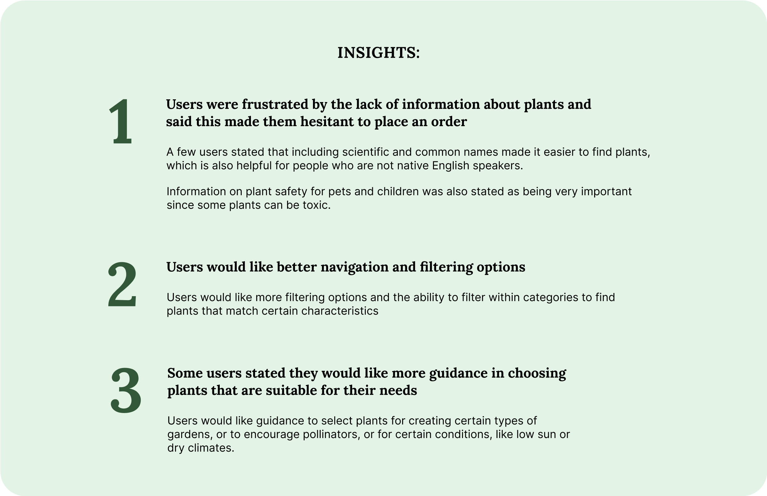
Many gardeners become frustrated when shopping for plants online due to complicated navigation and inadequate information.
Gardeners want better information and guidance about plants to feel confident in making a purchase.
THE INSPIRATION
I was inspired to create a mobile website for a plant nursery after hearing the frustrations my mother had looking for plants online.
Her complaints centered around a lack of information and difficulty searching for plants to meet the constraints of her yard. Her experience was that websites either overloaded shoppers with options or didn’t provide enough information to allow her to feel secure in her purchase.
DESIGN PROCESS OVERVIEW
I focused on understanding the difficulties faced by gardeners of varying backgrounds when shopping for plants online.
Keeping in mind the issues my mother had when searching for plants, I did a competitive analysis of plant nurseries to find the usability issues these sites have.
My user research consisted of survey questions and interviews. I posted questions and shared surveys on gardening forums and subreddits and interviewed 5 people about their online plant shopping experiences. Using this data I created an affinity map to highlight themes in user experiences and pain points.
After conducting user research I created two user personas and journey maps. From here I created user flows which further helped me define the needs of my application design and create a site map.
Next, I started to ideate, first creating sketches, then low-fidelity mockups, and prototypes.
I tested the low-fidelity prototype on 5 participants of varying degrees of experience. Once I had their feedback I created high-fidelity mockups and a prototype and tested it on 5 participants. I made changes based on feedback and after several iterations decided on the final design.
THE PRODUCT
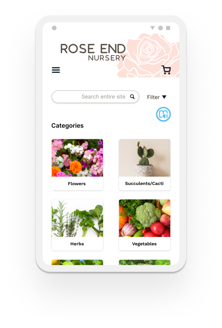
The Rose End Nursery app allows shoppers to easily find plants that match their desired characteristics and maintenance requirements.
Rose End Nursery wants to provide a better user experience for customers, so they can find what they’re looking for quickly and purchase with confidence.
1
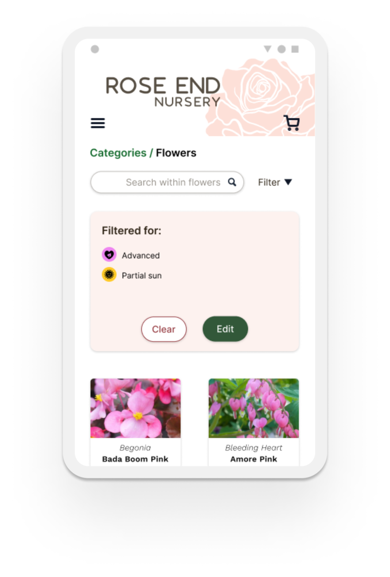
Navigation and filtering that make it easy to find plants with desired characteristics.
I designed an integrated navigation system that combines the categories, search, and filter to give customers more control. Customers can do a global search, search and filter within any category, and refine a search with the filter.
2
Provide adequate information so that users feel confident making a purchase online.
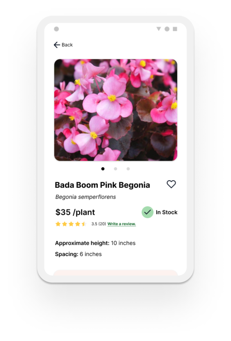
Users complained that inadequate information was a big frustration for them when shopping for plants. I designed a product description that is easily scannable and uses tags from the filter which helps maintain consistency and searchability across the application.
3
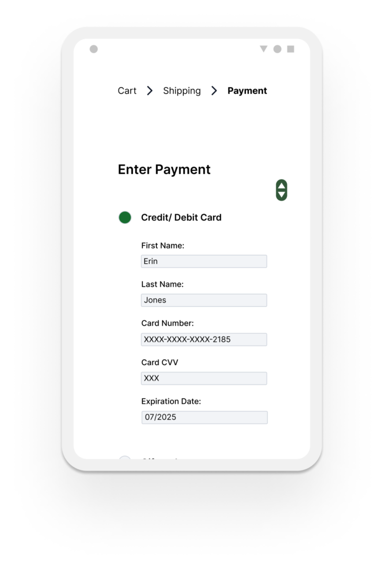
Checkout that is intuitive and signals users about their progress.
I broke down the checkout process into steps, with each step on a different page, to allow users to focus on one part of the process at a time. I also highlighted the current page to show users where they are.
BUSINESS OPPORTUNITIES
By allowing users to filter for plants with certain characteristics and providing adequate information, businesses can create a more efficient shopping experience, resulting in increased customer satisfaction and loyalty.
By integrating the navigation system, users can search by category, search bar, and filter to quickly narrow down results for their specific needs. Customers finding what they need faster increases sales and prevents site abandonment.
Providing adequate information is especially important in gardening because of how many variables gardeners need to consider when selecting plants. It is equally important to make the information easily scannable and understandable. Doing so increases users’ confidence in the product and the brand, which will have users coming back.
COMPETITIVE ANALYSIS
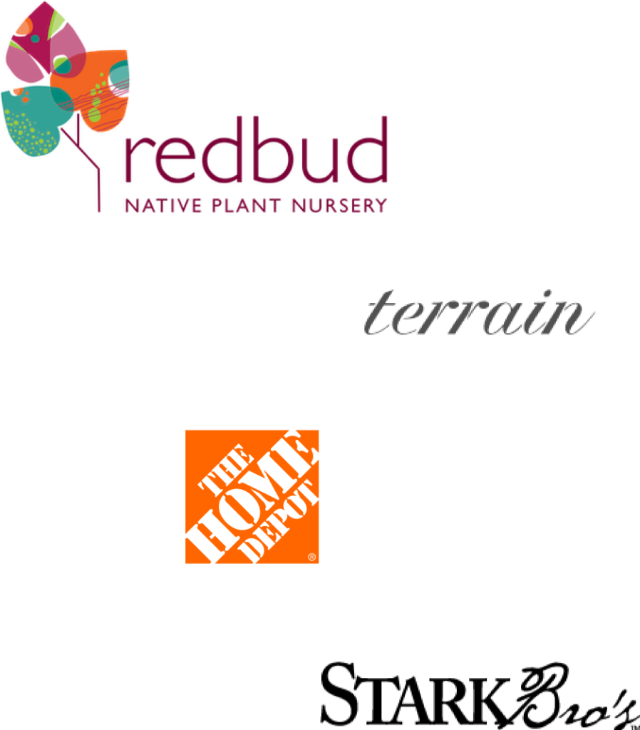
I reviewed some brands that gardeners mentioned in my user research. Many sites suffer from the same problems. I summarized their positive and negative features to help me in my design decisions.
Other brands’ shortcomings:
Too many disconnected ways to navigate
Lack of adequate information
Information is difficult to scan
Limited filter options
Cluttered/distracting design
No breadcrumbs
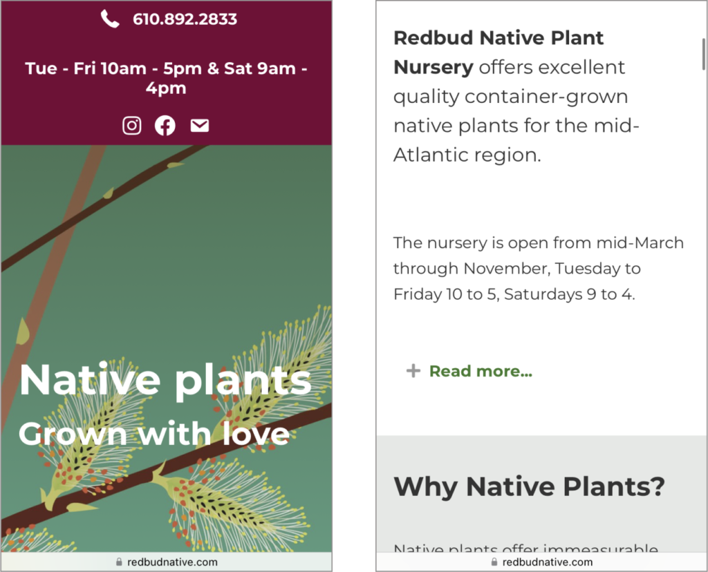
Redbud
Pros:
Offers niche gardening information with focus on native and organic plants
Attractive, inviting website
Cons:
No photos of their stock
Doesn’t list prices or any way to order plants online
Categories are barely visible and overlap with text at the top of the screen
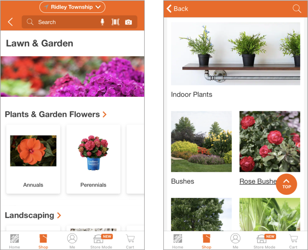
Home Depot
Pros:
Easy sign-in
Easy checkout
Has breadcrumbs
Cons:
Overwhelming and distracting website
Lacks some important information
Too many navigation options which don’t feel cohesive
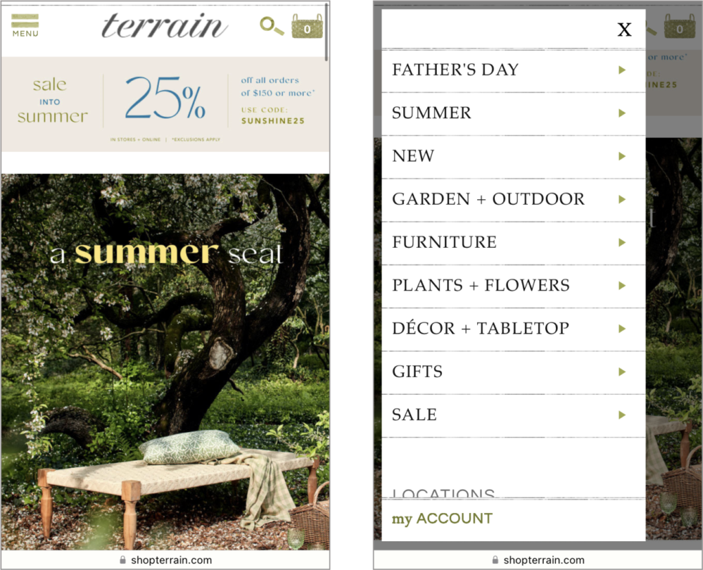
Terrain
Pros:
Neatly organized categories
Good navigation and user flow
Includes breadcrumbs
Cons:
Site is overwhelming
Information on plants is not easily scannable
No information on plant toxicity
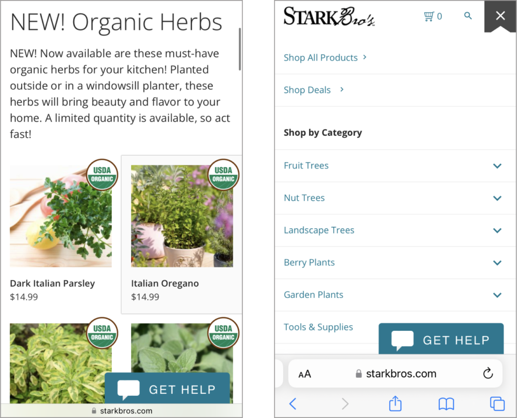
Stark Bro's
Pros:
Well-organized and intuitive categories
Includes whether plant is out of stock
Good visual hierarchy
Cons:
A little cluttered with distractions
No breadcrumbs
How can we avoid the issues on other brands' sites?
Provide adequate information that is easy to scan
Design an integrated navigation system
Provide more filtering options
Keep design minimal
Add breadcrumbs
USER RESEARCH
To understand the experiences that users have shopping for plants online, I conducted user research which included posting questions on gardening forums, sharing a survey online, and interviews.
This approach allowed people to share their experiences and pain points with varying commitments of time and enabled me to gather more feedback.
Respondents on forums were asked about online shopping pain points, positive experiences, their favorite sites to shop, and what could be improved.
Survey participants and interviewees were asked about their level of expertise, the types of plants they are interested in, and their shopping habits and experiences.
I aggregated this feedback using affinity mapping to find insights. The feedback from my survey, interviews and YouTube reviews can be seen here: https://miro.com/app/board/uXjVPfOczks=/
DESIGN APPROACH
Focus on information and navigation
Users complained about difficulty finding what they wanted on plant nursery sites, either from lack of information, poor filtering options, or limited categories.
From my own reviews of websites I found that some didn’t have integrated search, categories and filters. If the website did allow searching or filtering within a category (not just globally) it wasn’t always visually apparent. In my design I focused on signaling to users where they were searching.
I designed the navigation with these usability
heuristics in mind:
“Visibility of system status”, providing feedback to let users know where they are, whether actions have been completed, etc.
“User control and freedom”, allowing users to start navigating from different points, go back, and move freely
Maintain “consistency”, by using consistent language, tags, and icons throughout the design
“Recognition rather than recall”, by showing users where they are and what items have been selected
“Aesthetic, minimalist design”, to keep the users focused on the task they are on. Organize the navigation to minimize redundancy. I wanted users to have different ways to get to the same information but not in a way that leaves them feeling overwhelmed.
Source: Ten Usability Heuristics for User Interface Design
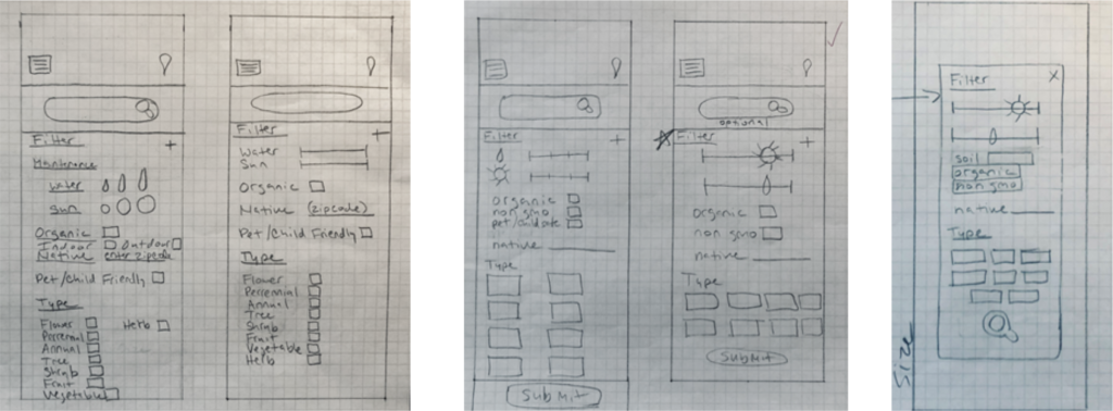
PAPER WIREFRAMES
I sketched out some ideas for the filter screens to see how items would fit on the page. Ultimately, I decided on filter categories that reflected commonly searched characteristics and a section at the top showing selected items. I also included a sticky “apply” button to eliminate the need to scroll.
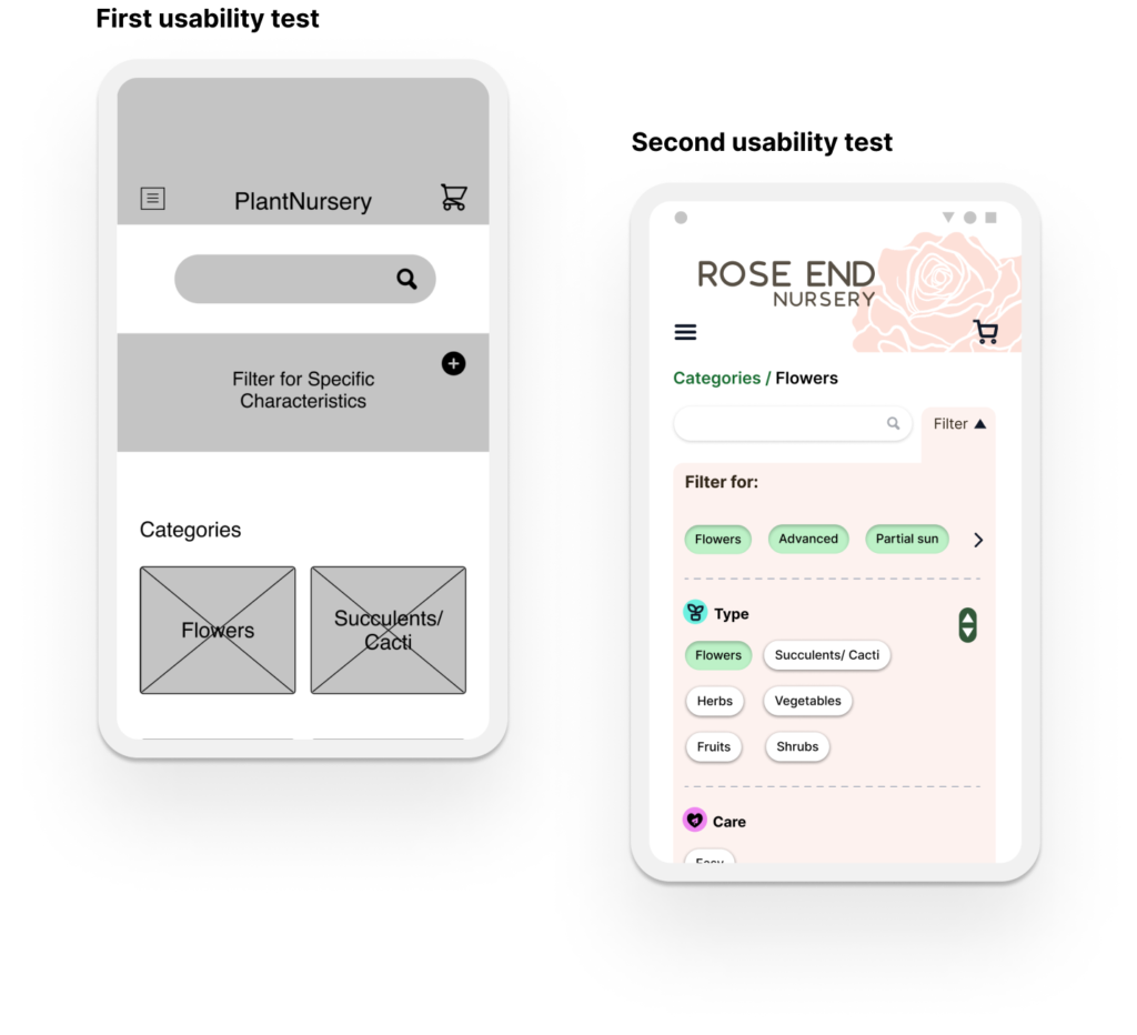
USABILITY TESTING AND ITERATION
I conducted two usability tests, first with the low-fidelity prototype and then with a high-fidelity prototype. In both usability tests I conducted a moderated study on 5 participants. For each study I tested various navigation paths a user could take through the app.
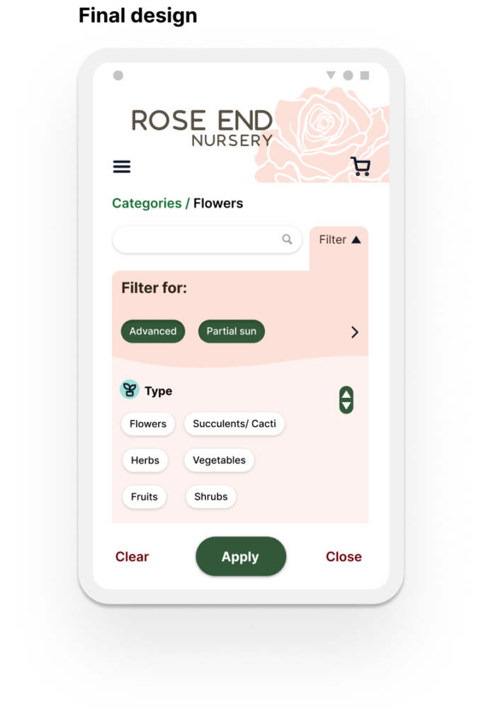
Filter
In my first prototype I placed the filter under the search bar. In the first usability test users said they had trouble seeing the filter. One user said that because the filter was in a darker box below the search bar their eyes skimmed over it. They stated that normally, on websites they visit, boxes like these are used for promotions and it’s something they tend to avoid. Other users didn’t notice the filter right away. Some stated that they were unaware that the filter and search bar worked together.
In my second usability test, several users stated that the “filter for” section should be more visually separated from the rest of the filter because it was difficult to tell that these were selected items being shown.
Changes I made in the next iteration:
After looking more into filter design to find out what users’ expect to see I decided to place the filter to the right of the search bar. By doing this, I was following the heuristic principle that states that user’s expect your product to function the same as others.
By making this change I made it apparent that the search and filter work together. This was following the law of proximity which states that items close together are perceived to be grouped and share a similar function.
I made several iterations of the filter to distinguish between current selections and further filter options. I added a different color to the top to visually separate it from the rest.
Navigation
In my first usability test users stated that they were unsure about what the “X” would do if they clicked on it. They said they often felt hesitant to click on these on other sites they frequented because they were worried they might lose something, or that it would undo their work.
Changes I made in the next iteration:
I changed the “X” buttons to more direct buttons, like “back” with an arrow pointing to the left.
Checkout
In my first usability test one user pointed out that they should be allowed to enter a different name for the credit card during checkout. They said this is especially important for people who may go by a different name. It also makes sense in cases where the person receiving the item may not be the same one paying for it.
Changes I made in the next iteration:
I added a form for the payment method that included name fields. I also changed the credit card to credit/debit so that people know they can use either.
In the future I would add more payment methods, because there are many that I didn’t account for.
Other changes
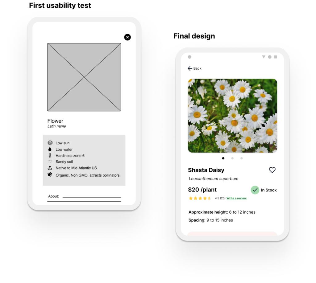
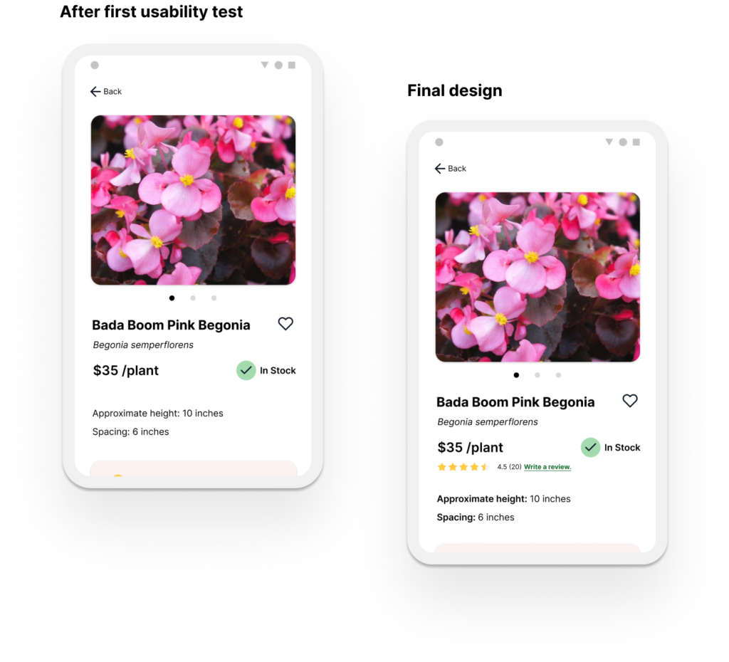
In my second usability test several users thought that the product page should have a star rating and review option. They said this is something they often use when shopping online and that it helps with their purchasing decisions.
Changes I made in the next iteration:
In my final design I added a star rating and review section to the top left of the product page.
ACCESSIBILITY
Font size
Following the Web Content Accessibility Guidelines I tried to maintain a text size of around 14 or greater and only used size 12 where necessary given the space restrictions of the application.
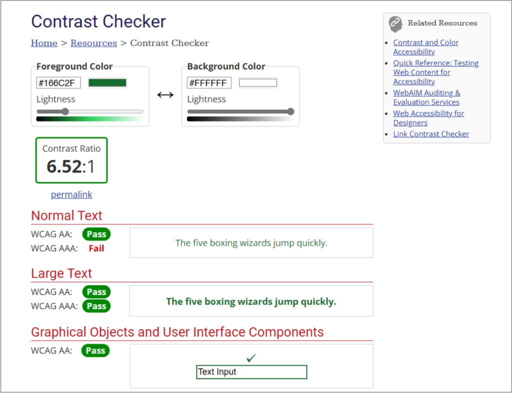
Color and Contrast
I checked my color palette with WebAIM’s contrast checker to ensure WCAG compliance. The white background, black text, and green buttons, links, and highlights I used met the minimum contrast requirement with an AA ratio of 6.52:1.
Accessibility
I added a screen reader icon to the app to help vision-impaired users. In hindsight I would change this to the universal access icon to add more accessibility settings options. I would recommend the business use a widget such as Accessibe to make sure they are WCAG and ADA compliant.
FINAL SCREENS
DESIGN SYSTEM
I developed a design system for Rose End that would allow me to easily make changes but also adjust sections of the page as needed to respond to users’ actions. This way I was able to easily see and test out different layouts to find which worked best. I created variations of each component that could be easily swapped.
Typography
I chose Font Awesome 6 for the logo text because I thought it conveyed a sense of calm but was also clean and minimal. It is a sans-serif typeface with rounded edges.
I went with Work Sans for category text and Inter for other headings and body text that had to be easily readable at a small text size. These typefaces matched the feeling of the brand which I wanted to convey a sense of calm and warmth.
Color Palette
I used a light rose color to match the brand and logo. The color was used for the logo and filter which I wanted to stand out on the page but also feel warm and inviting. Pink is also associated with a sense of calm and health. On other pages I also used a dark green for CTA buttons because they needed to pop on the white page and because these buttons required more contrast. Green is also a positive, calm color which is associated with positive actions.
IMPACT
Rose End Nursery App provides a clean and minimalized user experience that prioritizes the information that gardeners are looking for. The search, filter, and categories work together seamlessly, allowing the user to easily find plants that meet their criteria. The design of these three functions focuses on transparency, ensuring that users always know if they are searching or filtering the entire site, or within a category.
LESSONS LEARNED
Creating an integrated navigation and providing adequate feedback to users to signal where they were searching was not as straightforward as it seemed, but it was pleasing to see that test participants understood how it functioned after the changes were made following the usability tests.
Some things I would change in future iterations:
Expand on accessibility options. Cater to more diverse needs of users through an accessibility settings feature.
Expand the tags options. The filter could include a wider range of searchable characteristics.Design a detailed plant care
sheet. Include a care sheet with easily scannable information.
For more inquiries, or to grab a coffee, email me at [email protected]. Thank you for reading!